Cart
0
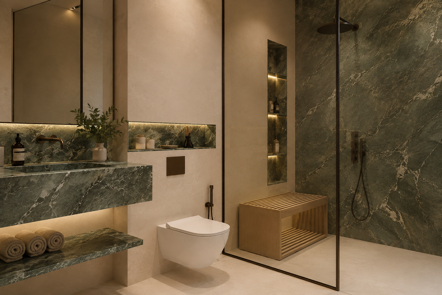
Bathroom Color Trends 2026: 10 Colors Transforming Australian Bathrooms
Australian bathrooms are moving away from the cool, clinical palettes that dominated interiors for years. In 2026, the strongest bathroom color trends are warmer, softer and noticeably more connected to natural materials.
Instead of relying on bright white surfaces and cool grey finishes throughout the entire room, homeowners and renovators are creating bathrooms with layers of warm neutrals, stone-inspired colours, muted greens, natural timber and carefully selected darker accents.
The result is a bathroom that still feels clean and contemporary, but also more comfortable, considered and personal.
Importantly, choosing a bathroom color scheme isn't simply about selecting a fashionable wall color. Your tiles, vanity, basin, tapware, shower fittings, benchtop and accessories all contribute to the final palette.
In this 2026 Australian guide, The Watermark Collection explores 10 bathroom colour directions worth considering and, more importantly, how to combine them without creating a bathroom that feels dated as soon as trends change.
If you're starting a renovation from scratch, browsing our bathroom and interior tile collection can be a useful starting point. The largest surfaces in the room usually establish the base palette, while vanities, basins and tapware can then be layered around them.
What Bathroom Colours Are Trending in Australia in 2026?
Bathroom color trends for 2026 in Australia favour warm, nature-inspired palettes including soft whites, sand and beige, limestone and travertine tones, muted sage green, natural timber, earthy brown and clay colors. Rather than using one statement color everywhere, contemporary bathrooms are layering neutral tiles with timber vanities, subtle color and carefully chosen metallic or dark tapware accents.
AI Overview: Bathroom Color Trends 2026
The biggest shift in bathroom design for 2026 is from cool minimalism to warm minimalism. Neutral bathrooms are still popular, but the neutrals themselves are becoming warmer and more textural.
For Australian homes, this translates particularly well to contemporary, coastal, organic-modern and luxury bathroom interiors.
| 2026 Colour Direction | Overall Feel | Works Well With | Best Use |
|---|---|---|---|
| Warm White | Clean & Soft | Timber, stone, brushed metals | Whole bathroom |
| Sand & Beige | Warm & Relaxed | Natural timber, brass, cream | Tiles and large surfaces |
| Travertine & Limestone Tones | Natural & Luxurious | Brushed metals, oak, white basins | Feature or full-height surfaces |
| Sage & Muted Green | Calm & Organic | Warm white, timber, stone | Feature tiles or cabinetry |
| Natural Timber | Warm & Architectural | Stone, white, beige, green | Vanities and cabinetry |
| Earthy Brown | Rich & Sophisticated | Cream, stone, brass | Feature surfaces |
| Warm Grey | Contemporary & Balanced | Timber, white, gunmetal | Tiles and neutral foundations |
| Terracotta & Clay | Earthy & Characterful | Warm white, timber, aged metals | Feature areas |
| Charcoal | Dramatic & Refined | Stone, timber, light neutrals | Controlled contrast |
| Metallic Accents | Polished & Premium | Depends on base palette | Tapware and accessories |
Quick Comparison: Which 2026 Bathroom Palette Suits Your Style?
| If You Want... | Try This Palette |
|---|---|
| A timeless modern bathroom | Warm white + beige + natural timber |
| A luxury hotel-inspired bathroom | Travertine tones + warm white + brushed metallic accents |
| A calm organic bathroom | Sage green + stone + oak |
| A coastal Australian bathroom | Sand + soft white + light timber |
| A dramatic contemporary bathroom | Charcoal + warm timber + light stone |
| A warm Mediterranean-inspired bathroom | Clay + cream + natural timber |
| A neutral palette with character | Limestone + timber + subtle metallic accents |
Best starting point: rather than choosing a favorite color first, decide how you want the bathroom to feel. Calm, warm, dramatic, coastal and hotel-inspired bathrooms require very different levels of contrast.
Why Bathroom Colours Are Getting Warmer in 2026
For several years, many modern bathrooms followed a familiar formula: bright white, cool grey, marble-look surfaces and strong black accents.
That combination can still work beautifully, but in 2026 we're seeing a broader interpretation of minimal bathroom design.
Homeowners are increasingly looking for bathrooms that feel less clinical and more connected to the rest of the home. Natural materials, softer neutrals and subtle color help achieve that transition.
The key difference is that neutral no longer means colourless.
A bathroom can remain highly minimal while incorporating:
- cream instead of stark white;
- limestone instead of cool grey;
- oak instead of glossy white cabinetry;
- sage instead of a strong feature color;
- brushed metal instead of high-contrast tapware; and
- textured stone-look tiles instead of completely flat surfaces.
This creates depth without making the room visually busy.
If you're also selecting the major fixtures for your renovation, our guide to modern bathroom fixtures in Australia explains how fixture selection can influence the overall look of a contemporary bathroom.
1. Warm White Is Replacing Stark, Clinical White
White bathrooms aren't disappearing in 2026. Instead, the type of white being used is changing.
Cool, brilliant whites can create a crisp appearance, but when used across every surface they may also make a bathroom feel clinical. Warmer whites introduce subtle cream, ivory or stone undertones that soften the room while preserving the brightness homeowners expect from a modern bathroom.
Why Warm White Works
Warm white is exceptionally versatile because it provides a neutral backdrop without dominating the room.
It works particularly well with:
- light oak vanities;
- travertine-inspired tiles;
- beige stone;
- brushed nickel;
- brushed brass;
- soft grey; and
- muted green.
It can also be a smart choice for bathrooms with limited natural light, where darker palettes may feel heavier than expected.
How to Use Warm White Without Making the Bathroom Boring
The secret is texture.
Instead of making the floor, walls, vanity and basin exactly the same white, introduce subtle variations through material and finish.
For example, you might combine warm white wall tiles with a stone-look floor, timber vanity and white ceramic basin. The palette remains quiet, but the room gains depth through texture rather than additional color.
If you're choosing the basin after establishing your colour palette, our Bathroom Basin Buying Guide can help you compare different basin configurations without turning colour selection into another design decision.
2. Sand, Beige and Soft Stone Neutrals
If there is one color family that captures the direction of Australian bathroom design in 2026, it's the move towards sand, beige and soft stone-inspired neutrals.
These colors work particularly well in Australian interiors because they complement natural light and pair easily with timber, stone and a wide variety of tapware finishes.
Unlike the yellow-beige bathrooms associated with older interiors, today's beige palettes are more sophisticated. Think:
- soft sand;
- oatmeal;
- mushroom;
- warm greige;
- light limestone;
- cream; and
- natural stone.
Why Beige Bathrooms Are Coming Back
Beige offers something cool grey sometimes struggles to achieve: warmth without requiring strong color.
It can make a bathroom feel calm and comfortable while remaining neutral enough to work with changing accessories and styling over time.
For homeowners concerned about trends dating quickly, this makes warm stone neutrals one of the safer ways to introduce the 2026 aesthetic.
Our Favorite Combination
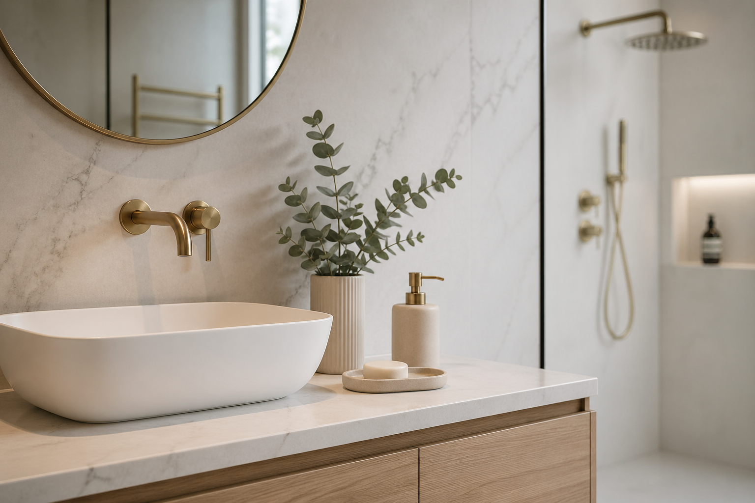
Sand-colored tiles + natural oak vanity + white basin + understated metallic tapware.
This combination feels contemporary but isn't dependent on one highly recognisable trend.
Browse tiles at The Watermark Collection to compare neutral surfaces before selecting the smaller fixtures and finishes around them.
3. Travertine and Limestone-Inspired Tones
Natural stone continues to influence premium bathroom interiors, but you don't necessarily need a bathroom covered in real stone to achieve the look.
Travertine and limestone-inspired colours bring together several of the biggest 2026 themes: warmth, texture, natural variation and understated luxury.
The palette typically includes:
- warm ivory;
- light beige;
- soft taupe;
- sand;
- cream; and
- subtle earthy variation.
These tones can work particularly well on larger surfaces because their visual variation adds interest without relying on bold colour.
What Tapware Works With Travertine Tones?
Several finishes can work, depending on the amount of contrast you want.
Brushed brass can reinforce the warmth of the stone, brushed nickel can create a quieter contemporary look, while matte black can introduce stronger architectural contrast.
Rather than repeating the pros and cons of individual tapware finishes here, we've covered that separately in our Matte Black vs Brushed Brass Tapware comparison.
You can also browse our Bathroom Tapware collection once you've established the dominant colors in your bathroom.
4. Sage and Muted Green Bathrooms
Green remains one of the most natural ways to introduce colour into a bathroom, but the strongest 2026 applications are generally softer and more muted than bright statement greens.
Sage, eucalyptus, olive-grey and dusty green can introduce personality while maintaining the calm atmosphere many homeowners want from a bathroom.
Why Green Works So Well in Bathrooms
Green naturally complements many materials already popular in Australian bathrooms, including:
- timber;
- stone;
- warm white;
- cream;
- beige; and
- brushed metallic finishes.
This makes it easier to introduce than colours that require an entirely separate palette.
You Don't Need a Completely Green Bathroom
One of the most effective ways to use green in 2026 is as a supporting color rather than covering every surface.
For example:
| Green Application | Combine With | Result |
|---|---|---|
| Sage Feature Tiles | Warm White + Timber | Soft Organic |
| Muted Green Vanity | Stone + White Basin | Contemporary Statement |
| Green Mosaic Detail | Neutral Large-Format Tiles | Subtle Character |
| Olive Accent | Beige + Brass | Warm & Sophisticated |
This approach also makes the bathroom easier to update later because the strongest colour is limited to a controlled area.
Should Your Vanity Match Your Bathroom Color?
Not necessarily.
In many of the strongest 2026 bathroom schemes, the vanity is used to introduce a second layer of color or material rather than disappearing into the wall.
For example, a warm neutral tiled bathroom can be paired with:
- a natural timber vanity for warmth;
- a muted green vanity for subtle color;
- a soft white vanity for a lighter look; or
- a darker vanity for stronger contrast.
The important thing is that the vanity relates to the overall palette rather than looking like it was selected independently.
If you're still deciding on the vanity itself rather than simply its colour, our Bathroom Vanity Buying Guide covers the broader selection process, while you can browse the current Bathroom Vanities at The Watermark Collection when you're ready to compare options.
The 60–30–10 Approach Can Help Keep Bathroom Color Balanced
If you're worried about introducing too many colours, a simple design principle can help.
Think of the bathroom in three visual layers:
- 60% dominant color: usually your main floor and wall surfaces.
- 30% supporting color or material: often the vanity, feature wall or secondary tile.
- 10% accent: tapware, accessories, lighting or smaller decorative details.
This isn't a strict mathematical rule. It's simply a useful way to prevent every surface from competing for attention.
For example:
| Layer | Example |
|---|---|
| Dominant | Warm limestone-look tile |
| Supporting | Natural oak vanity |
| Accent | Brushed brass tapware and accessories |
The result feels layered and intentional without requiring a large number of colors.
5. Natural Timber Tones Are Becoming Part of the Color Palette
Technically, timber isn't a paint colour, but in 2026 it plays such an important role in bathroom palettes that it deserves to be treated as one.
Natural timber introduces something that completely tiled bathrooms can sometimes lack: visual warmth.
Light oak, warm walnut and other natural wood-inspired finishes can soften large areas of stone or neutral tile while creating a stronger connection with the cabinetry used throughout the rest of the home.
Which Bathroom Colors Work Best With Timber?
Timber is surprisingly versatile, but the undertone matters.
| Timber Direction | Pairs Well With | Overall Look |
|---|---|---|
| Light Oak | Warm White, Sand, Sage, Limestone | Light & Organic |
| Warm Oak | Beige, Cream, Travertine | Relaxed & Luxurious |
| Walnut | Warm White, Stone, Charcoal | Rich & Architectural |
| Dark Timber | Cream, Soft Grey, Light Stone | Dramatic & Contemporary |
For many Australian bathrooms, a timber vanity is enough to introduce warmth without requiring a strong color on the walls.
For example, a bathroom with warm stone-look tiles, a natural timber vanity and a white basin can remain highly neutral while still feeling layered and inviting.
When comparing cabinetry options, explore the Bathroom Vanities at The Watermark Collection alongside your tile samples rather than selecting each element independently.
6. Chocolate Brown and Rich Earthy Tones
Brown is returning to contemporary interiors, but not in the heavy or dated way some homeowners might remember.
In 2026 bathrooms, the strongest browns are influenced by natural materials: chocolate, walnut, clay, cocoa, coffee and deep earth tones.
These colors can add depth to bathrooms dominated by lighter neutrals.
How to Use Brown Without Making the Bathroom Feel Dark
The safest approach is usually to balance rich brown with lighter surrounding surfaces.
For example:
- Chocolate vanity + warm white walls.
- Dark timber + light limestone-look tiles.
- Brown feature tile + cream surrounding tiles.
- Walnut cabinetry + pale stone benchtop.
Rather than making every surface dark, allow the deeper colour to provide visual weight while the rest of the bathroom remains lighter.
This is particularly effective in larger ensuites where a darker vanity can become an architectural feature without overwhelming the room.
7. Grey Isn't Gone — It's Getting Warmer
Grey has been one of the dominant bathroom colours for years, so it would be misleading to suggest that grey bathrooms are suddenly disappearing.
What's changing is the undertone.
Cool blue-grey schemes are increasingly being replaced by warmer greys, greige and stone-inspired neutrals that sit more comfortably alongside timber and warm metals.
This makes grey easier to integrate into the warmer direction of 2026 interiors.
Cool Grey vs Warm Grey in 2026
| Cool Grey | Warm Grey / Greige |
|---|---|
| Blue or silver undertones | Beige, taupe or stone undertones |
| Crisper appearance | Softer appearance |
| Works naturally with chrome | Works well with timber and brushed finishes |
| Can feel cooler in low natural light | Usually creates a warmer atmosphere |
If you already have a grey bathroom, this doesn't mean you need to replace everything to make it feel current.
Introducing timber, warmer towels, softer lighting or a carefully selected tapware finish can shift the overall character without changing the entire palette.
8. Terracotta, Clay and Muted Earth Colours
For homeowners who want more color than beige but still prefer a natural aesthetic, clay-inspired shades are one of the most interesting directions for 2026.
Terracotta, dusty peach, muted rust and soft clay can bring warmth and individuality to a bathroom without relying on bright saturated colour.
These shades are particularly effective when used selectively.
Where Can You Use Clay Colours?
- Feature wall tiles.
- Shower niches.
- Small-format tiles.
- Vanity cabinetry.
- Decorative accessories.
- Towels and styling elements.
Pairing clay tones with cream, warm white or light stone helps keep the overall bathroom contemporary.
Natural timber can also work beautifully because both materials share warm, earthy undertones.
If you want to experiment with color without committing the entire bathroom to it, feature tiles are often one of the easiest ways to introduce a controlled statement. Explore the Tile Collection to compare feature options with more neutral surrounding surfaces.
9. Charcoal and Black Are Becoming Controlled Accents
Black isn't disappearing from Australian bathrooms in 2026. Instead, we're seeing a more considered approach to how dark tones are used.
Rather than automatically combining black tapware, black shower frames, black accessories, black mirrors and dark cabinetry in the same room, contemporary schemes often use charcoal or black as a controlled point of contrast.
This allows dark finishes to define the architecture without overpowering softer materials.
Good Ways to Use Dark Contrast
Consider limiting dark tones to one or two connected elements, such as:
- tapware and shower hardware;
- a dark vanity against light tiles;
- charcoal floor tiles with warm walls;
- mirror frames and selected accessories; or
- a single feature surface.
The surrounding palette can then remain softer through timber, stone, beige or warm white.
Is Matte Black Tapware Still in Style in 2026?
Yes, matte black can still look highly contemporary when it supports the overall design rather than being selected simply because it is fashionable.
It works particularly well when the bathroom needs stronger contrast, while warmer metallic finishes can create a softer effect.
If you're specifically deciding between these two directions, read our Matte Black vs Brushed Brass Tapware comparison. Keeping that detailed finish comparison separate allows you to choose your overall bathroom palette first.
10. Metallic Finishes Are Being Used Like Color
Tapware may occupy less visual space than tiles or cabinetry, but its finish can strongly influence the way a bathroom palette feels.
In 2026, metallic finishes are increasingly being treated as the final colour layer rather than simply a functional detail.
Popular directions include:
- Chrome for clean brightness.
- Brushed nickel for understated warmth.
- Brushed brass and gold tones for warmer palettes.
- Gunmetal for sophisticated contrast.
- Matte black for stronger architectural definition.
Match the Tapware Undertone to the Bathroom
| Bathroom Palette | Tapware Direction to Consider |
|---|---|
| Warm White + Oak | Brushed Nickel, Brass or Chrome |
| Travertine + Cream | Brushed Brass or Brushed Nickel |
| Sage + Timber | Brushed Nickel, Brass or Black |
| Warm Grey + White | Chrome, Gunmetal or Brushed Nickel |
| Charcoal + Timber | Brushed Nickel or Black |
| Clay + Cream | Warm Metallic Finishes |
These combinations aren't strict rules. Natural light, tile undertones and surrounding finishes can change how metal appears in the finished bathroom.
That's why it's worth comparing samples whenever possible before committing to the final combination.
Once your colour palette is established, browse Bathroom Tapware at The Watermark Collection to compare finishes that complement your tiles, vanity and basin.
How to Coordinate Tiles, Vanity, Basin and Tapware
One of the easiest ways for a bathroom colour scheme to go wrong is to select every product individually.
You find a tile you love.
Then a vanity you love.
Then a basin.
Then tapware.
Individually, each choice may look beautiful. Together, however, their undertones and visual styles may compete.
A better approach is to build the palette in layers.
Step 1: Establish the Dominant Surface
Start with the largest visual areas—usually the floor and wall tiles.
Ask whether their undertone is:
- warm;
- cool;
- neutral;
- earthy; or
- high contrast.
Step 2: Add the Vanity
Your vanity can either blend with the dominant surfaces or create intentional contrast.
A timber vanity can warm up neutral tiles, while a soft white vanity can keep a smaller bathroom feeling lighter.
Step 3: Select the Basin
White basins remain exceptionally versatile because they provide a visual break between colored cabinetry and tapware.
More architectural stone or solid-surface basins can also become part of the palette rather than simply sitting on top of it.
If material is your next decision, our Bathroom Basin Materials Explained guide compares ceramic, stone and solid surface separately so this colour guide doesn't need to duplicate that information.
Step 4: Add Tapware as the Accent
Once the major surfaces are established, use the tapware to either reinforce the warmth of the palette or introduce contrast.
Step 5: Repeat the Finish Carefully
A cohesive bathroom often repeats the selected finish through related elements such as shower hardware, towel rails, robe hooks or other small details.
However, avoid turning every object into a matching accent simply for the sake of consistency. The goal is visual connection, not repetition everywhere.
Our Bathroom Accessories Checklist can help when you're ready to coordinate those finishing details.
Best Bathroom Colours for Small Bathrooms in 2026
Small bathrooms don't have to be completely white, but controlling contrast can help the room feel calmer and less fragmented.
Strong options for 2026 include:
- Warm white + light oak.
- Soft beige + white.
- Light limestone + timber.
- Warm greige + white basin.
- Soft sage feature + warm neutral surroundings.
Using similar tones across larger surfaces can reduce visual interruption, while color can be introduced through one controlled feature or the vanity.
Small bathroom tip: if you love a dark color, you don't necessarily need to avoid it. Use it intentionally rather than allowing several dark finishes to compete within the same compact space.
Best Colors for a Master Ensuite
A master ensuite provides more freedom to create a richer, more personalized palette because it is generally used by fewer people than the main family bathroom.
For a sophisticated 2026 ensuite, consider:
| Style | Palette |
|---|---|
| Hotel Inspired | Travertine + Walnut + Brushed Metal |
| Organic Luxury | Limestone + Oak + Warm White |
| Contemporary | Warm Grey + Timber + Gunmetal |
| Soft & Relaxed | Sand + Cream + Brushed Nickel |
| Statement | Charcoal + Light Stone + Timber |
If you're incorporating a large vanity into the ensuite, allow its finish to contribute to the palette rather than treating it purely as storage.
Best Bathroom Colors for Family Bathrooms
Family bathrooms usually benefit from a slightly more practical approach because the space needs to work for multiple people and withstand frequent use.
A strong base palette might include:
- warm neutral floor tiles;
- soft white or beige walls;
- timber or neutral cabinetry;
- a classic white basin; and
- a durable, coordinated tapware finish.
Color can then be introduced through smaller elements that are easier to change over time.
This approach can be especially useful when you're designing a bathroom that needs to suit both children and adults for many years.
Best Bathroom Colors for Coastal Australian Homes
Coastal bathrooms in 2026 don't need to rely on obvious blue-and-white styling.
A more contemporary coastal palette takes inspiration from the Australian landscape through:
- sand;
- soft white;
- limestone;
- light oak;
- muted eucalyptus green; and
- subtle brushed metal.
The result can feel coastal without becoming themed.
Natural textures are particularly effective here. Stone-inspired tiles and light timber create a relaxed atmosphere while maintaining the clean lines expected from a modern bathroom.
Best Colors for a Luxury Bathroom in 2026
Luxury bathrooms are moving away from the idea that expensive-looking design requires excessive marble, high contrast or statement fixtures everywhere.
Some of the most sophisticated 2026 palettes are actually restrained.
Consider combinations such as:
- Travertine + walnut + warm metallic tapware.
- Limestone + oak + brushed nickel.
- Warm white + textured stone + timber.
- Charcoal + light natural stone + walnut.
- Deep brown + cream + subtle brass accents.
What makes these bathrooms feel luxurious isn't the number of colors. It's the quality of the materials and the way each finish relates to the next.
If you're creating a more premium bathroom, our Luxury Bathroom Fittings Australia guide explores the fixture side of the design in greater detail.
Should Every Bathroom Fixture Be the Same Color?
No. A cohesive bathroom doesn't require the tiles, vanity, basin, tapware and accessories to all be the same color.
In fact, trying to match everything exactly can make a room feel flat.
Instead, aim for related undertones and intentional repetition.
For example:
Warm beige tiles → oak vanity → white basin → brushed nickel tapware.
None of these elements is exactly the same colour, yet they share a soft, warm direction.
Or:
Light stone tiles → walnut vanity → white basin → matte black tapware.
Here, the black provides deliberate contrast rather than trying to blend into the surrounding palette.
The question isn't “Does everything match?”
The better question is:
“Does every finish look intentional next to the finishes around it?”
One Important Rule: Check Colors in Your Actual Bathroom Light
A tile, vanity finish or metal sample can look very different in a showroom, online photograph and completed bathroom.
Natural light direction, artificial lighting and surrounding surfaces all affect how color is perceived.
Before committing to the major elements of your bathroom, compare samples together in conditions as close as possible to the finished room.
Look at them:
- in natural daylight;
- in the morning and afternoon if possible;
- under the proposed bathroom lighting; and
- next to the other finishes you intend to use.
This is particularly important with beige, greige, stone and metallic finishes, where subtle undertones can become much more noticeable once products are placed next to one another.
Which Bathroom Colors Will Still Look Good Beyond 2026?
Bathroom trends can be useful for inspiration, but a renovation should ideally last much longer than a trend cycle.
The safest approach isn't to avoid trends completely. Instead, use long-lasting colours across the expensive, difficult-to-replace surfaces and introduce more trend-driven colour through elements that can be changed more easily.
For most Australian bathrooms, warm whites, soft stone tones, limestone-inspired neutrals, beige, natural timber and carefully selected greige provide a strong foundation because they work across a wide range of interior styles.
More distinctive colors such as sage, terracotta, chocolate brown or charcoal can then be layered into the room depending on how much personality you want.
| Color Direction | 2026 Appeal | Long-Term Versatility | Best Approach |
|---|---|---|---|
| Warm White | Very High | Excellent | Safe for large surfaces |
| Sand & Beige | Very High | Excellent | Strong neutral foundation |
| Limestone / Travertine Tones | Very High | Excellent | Use for natural, premium interiors |
| Natural Timber | Very High | Excellent | Ideal for adding warmth |
| Warm Grey / Greige | High | Very Good | Choose warmer undertones |
| Sage Green | High | Good | Use selectively if longevity is important |
| Chocolate Brown | High | Good | Balance with lighter surfaces |
| Terracotta / Clay | High | Moderate to Good | Best as a controlled feature |
| Charcoal / Black | High | Good | Use as deliberate contrast |
The takeaway: if you're concerned about your bathroom dating quickly, keep the foundation relatively timeless and allow smaller or easier-to-change elements to carry more personality.
Timeless vs Trendy: Where Should You Take More Design Risk?
Not every bathroom element has the same replacement cost or difficulty.
Changing towels or accessories is easy. Replacing floor-to-ceiling tiles is not.
This gives you a useful way to decide where to experiment with color.
Keep These More Timeless
- Main floor tiles.
- Large wall surfaces.
- Expensive stone surfaces.
- Major built-in elements.
- Anything difficult to replace without renovation work.
You Can Take More Color Risk With
- Feature tiles.
- Vanity finishes.
- Painted areas outside wet zones.
- Towels.
- Artwork.
- Decorative objects.
- Smaller accessories.
Tapware sits somewhere in the middle. It can make a strong visual statement, but because it is repeated throughout the bathroom, its finish should still relate carefully to the surrounding palette.
If you're specifically choosing between contrasting and warmer tapware finishes, our Matte Black vs Brushed Brass Tapware Guide provides a more detailed comparison without duplicating that discussion here.
7 Bathroom Color Mistakes to Avoid in 2026
1. Choosing Every Finish Separately
One of the easiest ways to create an inconsistent bathroom is to select the tiles, vanity, basin and tapware individually without comparing them together.
Each product may look beautiful on its own but still clash with the undertones of another material.
Create a physical or visual palette before ordering the major products.
2. Following a Trend Across Every Surface
If you love sage, terracotta or another trending colour, you don't necessarily need to use it on the floor, walls and cabinetry.
A trend often has greater impact when it is controlled.
3. Ignoring Undertones
Two colors can both be described as beige while looking completely different next to one another.
One may lean yellow, another grey, another pink or taupe.
This is why comparing samples together is so important.
4. Using Too Much Contrast in a Small Bathroom
Contrast can create definition, but too many sharp visual changes can make a compact bathroom feel fragmented.
Consider keeping the larger surfaces more closely related and using contrast selectively.
5. Assuming All White Bathrooms Are Timeless
White itself may be timeless, but an entirely white bathroom can still date through tile format, cabinetry, hardware and styling.
Instead of focusing on color alone, think about material, texture and proportion.
6. Matching Everything Too Perfectly
A sophisticated bathroom doesn't need every finish to be identical.
In fact, slightly varied but compatible materials often create more depth than trying to make every element the same colour.
7. Forgetting About Lighting
Color does not exist independently of light.
A warm beige tile may look soft and creamy in natural daylight but significantly darker under artificial lighting. Metallic finishes can also change character depending on the surrounding surfaces.
Always consider the finished lighting environment before making your final decision.
How to Build Your Bathroom Colour Palette Step by Step
If you're overwhelmed by the number of options available, don't try to choose the entire bathroom at once.
Build the palette in a logical order.
Step 1: Decide How You Want the Bathroom to Feel
Before choosing products, choose the atmosphere.
Do you want the bathroom to feel:
- light and coastal;
- warm and organic;
- minimal and contemporary;
- dark and architectural;
- soft and spa-like; or
- luxurious and hotel-inspired?
Step 2: Choose the Main Tile Direction
Your floor and wall surfaces usually occupy more visual area than anything else, making them the natural starting point.
Browse the Tile Collection at The Watermark Collection and identify whether you're naturally drawn towards warm stone, light neutrals, darker surfaces or feature color.
Step 3: Select a Vanity That Supports the Palette
Next, decide whether the vanity should blend into the room or introduce contrast.
For example:
- Warm stone + oak vanity = organic and relaxed.
- Warm white + walnut vanity = richer and more architectural.
- Beige + soft white vanity = light and understated.
- Light stone + charcoal vanity = stronger contemporary contrast.
You can explore Bathroom Vanities once your main surface direction has been established.
Step 4: Choose the Basin
The basin can either quietly complement the vanity or become a more sculptural feature.
White remains highly versatile, while stone and solid-surface designs can add another layer of texture and tone.
Browse Bathroom Basins alongside the vanity rather than treating the basin as an entirely separate decision.
Step 5: Add Tapware
Tapware is where you can introduce either continuity or contrast.
A warm metallic finish can reinforce beige, timber and travertine tones, while darker finishes can provide definition against lighter surfaces.
Explore Bathroom Tapware after establishing your dominant materials so the finish complements rather than dictates the entire scheme.
Step 6: Finish With Accessories
Finally, use accessories to repeat the selected finish and connect smaller details throughout the bathroom.
Our Bathroom Accessories Checklist can help make sure important finishing pieces aren't forgotten during the renovation.
2026 Bathroom Color Decision Guide
| If You Want... | Start With... | Add... |
|---|---|---|
| Timeless & Warm | Warm White + Limestone | Natural Oak + Brushed Metal |
| Modern Coastal | Sand + Soft White | Light Timber + Subtle Metal |
| Organic Luxury | Travertine Tones | Oak or Walnut + Warm Metal |
| Soft Color | Warm Neutral | Sage + Timber |
| Earthy Character | Cream + Stone | Clay or Terracotta |
| Contemporary Contrast | Light Stone | Charcoal + Timber |
| Hotel-Inspired Luxury | Travertine / Limestone | Walnut + Refined Metallic Finish |
| Easy-to-Live-With Family Bathroom | Warm Neutral | Timber + White + Simple Tapware |
Bathroom Color Checklist Before You Buy
Before ordering tiles, cabinetry and fixtures, check the complete palette together.
- Have you identified whether your main undertones are warm or cool?
- Have you compared the tile and vanity finish side by side?
- Does the basin complement the vanity and benchtop?
- Does the tapware create intentional contrast or harmony?
- Have you checked samples in natural light?
- Have you checked them under the proposed artificial lighting?
- Is there one clear dominant material or colour?
- Are too many elements competing for attention?
- Are expensive permanent surfaces relatively versatile?
- Could you update the look later without replacing the entire bathroom?
If the palette still feels confusing, simplify it. Removing one competing finish can often improve the design more than adding another.
Frequently Asked Questions About Bathroom Colors in 2026
What is the most popular bathroom color for 2026?
There isn't one single color defining bathrooms in 2026. The broader direction is towards warmer, nature-inspired palettes including warm white, beige, sand, limestone, travertine tones, natural timber and muted green.
Are grey bathrooms out of style in 2026?
No. Grey bathrooms can still look contemporary, but warmer greys and greige tones generally integrate more naturally with timber, stone and other warm finishes than the cooler blue-grey palettes that dominated previous years.
Are white bathrooms still in style?
Yes. White remains one of the most versatile bathroom colors, but warmer whites combined with timber, stone and texture can create a softer alternative to an entirely stark-white scheme.
Is beige back for bathrooms?
Yes. Modern beige bathroom schemes tend to use sophisticated sand, limestone, mushroom, cream and greige tones rather than the heavier yellow-beige palettes associated with older interiors.
Is sage green still popular for bathrooms?
Muted green remains a strong option for homeowners wanting color without overwhelming the bathroom. Sage works particularly well with warm white, natural timber, beige and stone-inspired surfaces.
Is matte black tapware still in style in 2026?
Matte black can still look contemporary, particularly when used as controlled contrast. However, it is now one of several strong options alongside chrome, brushed nickel, brass and gunmetal finishes.
What bathroom colors make a small bathroom look bigger?
Light warm whites, beige, limestone, soft greige and other low-contrast neutrals can help create a more visually continuous space. However, good lighting, tile scale, layout and fixture proportions are also important.
What colors make a bathroom look expensive?
A bathroom tends to look more premium when materials and undertones are coordinated rather than because of one particular color. Travertine-inspired neutrals, limestone, timber, warm white, walnut and refined metallic accents can create a sophisticated result when used with restraint.
Should bathroom tapware match the vanity?
Not necessarily. The tapware should complement the overall palette rather than match the vanity exactly. Contrast can work beautifully when it appears intentional and is repeated selectively elsewhere in the bathroom.
How many colors should a bathroom have?
There is no fixed rule, but many successful bathrooms use one dominant neutral, one supporting material or colour and one smaller accent finish. Limiting the palette can make the room feel calmer and more cohesive.
Final Thoughts: The Best 2026 Bathroom Color Is the One You'll Still Love Later
The biggest bathroom color trend for 2026 isn't one specific shade. It's the move towards warmer, more natural and more considered interiors.
Warm whites are replacing clinical whites. Beige and limestone are softening cool grey. Timber is introducing warmth. Sage and clay are bringing restrained color, while charcoal and metallic finishes are being used more selectively to create contrast.
But trends should be a source of inspiration rather than a set of rules.
The strongest bathroom palette is one that works with your home's architecture, available light and personal style while giving you enough flexibility to update smaller elements over time.
Start with the surfaces that are hardest to replace. Build the vanity and basin around them. Then use tapware and accessories to give the bathroom its final character.
When those elements work together, the result can feel current in 2026 without looking like it belongs exclusively to 2026.
Bring Your Bathroom Colour Palette Together
Choosing colors from individual photos is one thing. Seeing tiles, vanity finishes, basins and tapware together can make the final decision much easier.
If you've found a color direction you love but aren't completely sure which finishes will work together, you're welcome to visit The Watermark Collection showroom in Yagoona. Seeing the different materials and finishes in person can help you compare undertones, textures and combinations before committing to the final look.
You can also bring along photos, measurements or inspiration for your bathroom and speak with our team about the products you're considering. Whether you're creating a warm neutral bathroom, a coastal-inspired space, a darker contemporary ensuite or something completely your own, we can help you bring the individual pieces together.
See the Range in Person at Our Yagoona Showroom
The Watermark Collection
686 Hume Highway
Yagoona NSW 2199
Take the opportunity to compare tiles, vanities, basins and tapware side by side rather than trying to judge every finish separately from a screen.
If you prefer to start online, explore our Tiles, Bathroom Vanities, Bathroom Basins and Bathroom Tapware and start building a palette that works for your home.
Not sure what works together? Visit our Yagoona showroom and speak with The Watermark Collection team for friendly, practical product advice before making your final selection.
Explore Bathroom Products at The Watermark Collection →